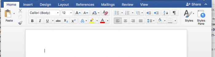
The name may be less common these days, but we're all familiar with the WYSIWYG (What You See Is What You Get) editor. Word processors like Microsoft Word are the dominant example. If you work on a web site, you've undoubtedly used one to create and edit pages. If you have, you've probably noticed that it doesn't work quite as well as the ordinary word processor. What You See is never quite What You Get. Why is this? Maybe the WYSIWYG editors for web sites are just bad. There's some truth to that, certainly, but the problem is actually deeper. To really understand the issue, we’re going to need look at the problems the WYSIWYG editor was meant to solve and how they differ from the problems we face on the web.
How we got to WYSIWYG
At the dawn of the computer age, the office was ruled by paperwork. The most common method of document preparation was the typewriter. It was easy to use, but, if you made a mistake, you often had to start over. In the mid 70s, as computers started entering large offices. it was possible to create documents on some of these computers, but the document needed to be described programmatically by interleaving arcane commands with the text to explain to the computer that the font needed to change or that the next line was to be underlined. It required a great deal of specialized knowledge to use and even more to use well. It was little help with the day-to-day paperwork.
Then the WYSIWYG editor was invented. By mimicking the then more familiar interface of the typewriter it allowed a less-technical user to quickly get up to speed and required very little specialized knowledge. Suddenly it was possible to use a computer for paperwork. It was less error-prone and more efficient than the typewriter as individual mistakes could be undone without having to retype an entire page. Most WYSIWYG editors work the same internally as the programmatic typesetters but they hide this from the user. Instead, they present the document to the user graphically, as it would appear when printed, and allow the user to directly edit this presentation. This is the “What You See”-half. The “What You Get”-half works because the editor knows the dimensions of the final output: a piece of paper. They can scale their display so that, when you hit print, a point on the screen corresponds to a point on the actual piece of paper.
The personal computer revolution of the 80s brought WYSIWYG editors to smaller offices and even homes.
Then in the 90s something different happened: the world wide web.
At its heart the web is a decentralized but interconnected document store. The languages for describing web documents is much like that used internally by WYSIWYG editors: an intermingling of text and commands to tell the computer how to interpret the text.
WYSIWYG and the Web
Creating WYSIWYG editors for web sites seemed like a logical conclusion. They had 15 some years of technological momentum and almost 10 of social momentum—they were now the dominant method of document preparation, even for documents that were never printed. Unlike traditional WYSIWYG editors, the final output of these new editors was not paper but the web itself. This was a problem since, unlike paper, a web page could be any width. This problem was largely ignored. At the time, computer monitors mostly had the same resolutions, and, while they improved incrementally, they did so slowly. Setting the width of a web page to just under the width of the average resolution let web designers put the “What You Get” back into WYSIWYG. It’s not a problem if everyone agrees to ignore it, after all.
This worked for quite some time. Long enough that it became possible to embed WYSIWYG editors directly into the administrative area of a web site allowing pages on the site to be edited within the site itself. Long enough for it to become nearly impossible to find a website that did not let you do this.
In the meantime, monitors continued to improve—but more quickly. Computers became ever cheaper. Unrelatedly, cellular networks also continued to improve. Eventually, though, these trends merged into new trends: the smartphone and tablet computers.
Now there was no obvious width to set for a web site: there was simply too much variation and the extremes too dramatic. The solution was responsive sites. These are websites (like this one) that respond to the width of the device they are displayed on, becoming smaller or larger as necessary. That solved that problem, but it meant that the width of the site was no longer fixed. There goes the “What You Get”. You can spend hours tweaking a page and getting everything just-so on your computer, but the next day you look at it on your phone and everything is wrong. The only way around this is to not worry how the words will appear on the page and focus on getting the correct words in the right order. You have to surrender control of the presentation to the web site’s design.
While that is a large, visible mismatch between WYSIWYG and the web, there is a larger, entirely invisible mismatch.
WYSIWYG vs. Accessibility
When you tell a word processor to make the font larger so that it looks like a heading, it inserts a command to make the font larger. It’s concerned with making the text appear as you intend it to be printed and not the meaning—not what you mean to convey by making the font larger. The command does not say “this is a heading”. It just says “make this bigger”. Now, most word processors also contain a way to explicitly mark a selection as a heading, though, personally, I have never seen this used much outside of the publishing industry. It is quite a useful feature, though. For example, after marking several headings, you can tell the word processor how to format headings in general and it will automatically update the formatting of each heading in the document. It can also generate a table of contents based on the headings.
Largely, WYSIWYG editors for the web only let you change appearance by specifying meaning. If you want large text you have to mark it as a heading. The design of the site specifies how to style headings. If the site is redesigned, every heading on every page is automatically updated. There are ways to say simply “make this font larger” without attributing any specific meaning onto the larger text. These tend to be used sparingly, if at all, in web development: if a site using these is redesigned then each page on the site could need to be manually edited to fit the new design.
In effect, the defaults are reversed: word processors default to changing presentation, with the option to specify meaning, and the web defaults to specifying meaning, with the option to change presentation. Web editors, while appearing to operate the same as word processors, tend to only offer the mode that most users of word processors tend not to use.
Who cares?
If it looks right, what does it matter if it says it’s a heading but really is not? Just as a site can be displayed at many different widths it can also be interpreted by many different kinds of programs. While the web browser you’re using to read this article is the most familiar, the most common is actually the web spider: the program search engines use to discover and index the content of the ever growing web. Being mindless machines, these have to trust what you say as they have trouble inferring what you mean and this can have consequences for your search rankings. The larger problem is Assistive Technology. These are programs used in lieu of, or in addition to, a web browser that help people with physical or mental impairments navigate and interpret web sites. They require the meaning of the document to be encoded in its structure: making something look like a header, without marking it as such, is just as bad as marking something other than a header as a header. Making the web accessible is important and increasingly becoming required by law.
By reversing the defaults, web editors create false expectations and seemingly innocuous presentational flourishes can, at worst, have legal ramifications.
What are the alternatives?
Learn all the associated web technologies and manually code each document? That is one option. It will take quite a while to learn all the ins and outs but by the end you could create documents that, in addition to being accessible and responsive, look better than anything that could be created by even the most fantastical sci-fi WYSIWYG editor. A little bit of manual code will always be able to beat the code generated by an editor: it’s simply more flexible and expressive.
You probably don’t have time for that, though.
Despite everything said against web editors, they’re fine for the simple stuff: paragraphs, some bold, some italic, a link here or there, bulleted and numbered lists. As long as you stick to those and don’t try to add extra spaces or blank lines to make it look right, everything looks fine. But a bit drab. What about inline images or pull quotes or headers or, well, anything else?
A recent trend in web development offers the best solution so far. Rather than composing the entire page in an editor, you compose the page with a sequence of custom components. There can be many different components—regular text that uses a stripped down editor limited to safe and sane defaults, headers, pull quotes, images, even components that themselves take other components like a two-column layout container. It’s also not uncommon to define custom components entirely specific to a particular site. This is a little different to work with than the more familiar editor, but it is quite easy to pick up. The benefits are many. Each component can easily be made responsive, accessible, and tailored to a site’s design—and just as easily re-tailored during a redesign. The individual components can be arbitrarily complex while always being displayed consistently. They can have complex layout without any fuss: enter the data required and you’re done. Most importantly they fit with how the web works. What you see may not always be what you get, but it’s always you want.